Overview
Grids can be made to display information in ways that best fit a particular users requirements. The Field Chooser allows you to include or remove columns from the grid.
How to use grids
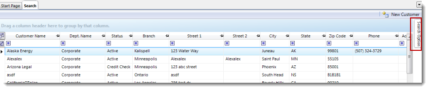
Information in Grids can be grouped by column headings by dragging the column header to the group header field.
After dragging a column header to the group header field the grid will be grouped by the criteria defined by the original column. For instance, if you drag the City column to the group header field the items in the grid will be grouped alphabetically according to their assigned city. You can change the sort order of the list by clicking the group header.
Grids can be grouped further by dragging additional column headers to the group header field. This will regroup the grid according to both sets of criteria. For instance if the Zip Code column header is added to the group header field with the City header, the grid will be broken down according to Zip Codes within a particular City. The grouping process can be repeated as necessary.
Field Chooser
The Field Chooser allows you to include or remove columns from the grid. To use the Field Chooser:
- Click the Field Chooser icon from the upper left-hand corner of the grid. At this point the Field Chooser will appear.
- To include a column in the grid, check the box on the Field Chooser of the column you'd like to add. Uncheck the box of any column you would like to remove from the grid. Checking and unchecking boxes from the field chooser will immediately add or remove the column from the grid.
- After adding and/or removing all of your desired columns, you can close the Field Chooser by clicking the "x" in the upper right hand corner of the Field Chooser.
Filter and sort columns
Columns can be filtered by:
- Highlight the cell directly below the header of the column you would like to filter. Select, or enter the criteria by which you'd like to filter.
Search Option slide-menu
The Search Option slide-menu provides you the ability to filter your searches in greater detail. The Search Option slide-menu icon can be accessed from the right-hand side of the search grid you are working on.
Clicking the Search Option icon will display the Search Option slide-menu. The slide-menu will be set to automatically hide when not in use. The slide-menu can be set to display, rather than hide, by clicking the tack icon in the upper-right of the slide-menu. If the tack-icon is pointing down, then the slide-menu is not set to auto-hide.
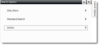
There are three drop-down choices on the Search Option slide menu, those being:
- Only Show/Show Only: This will allow you to filter the search results for the grid you are currently on. You can select the parameters for your search from this option.
Note: The filter options available here will vary depending on the section of Avionté you are currently accessing.
- Standard Search: Searches that have been created and saved from the Advanced Search feature will be displayed in this drop-down. For more information on Advanced Search click here.
- Action: The action drop down provides you the options to print your grid, or export it into XML format.
Comments
0 commentsPlease sign in to leave a comment.